Note: Past issues of Scripsit that are more than two years old may still be available
The Spring 2000 Scripsit is a unique undertaking, produced by Paul Shaw jointly for the Washington Calligraphers Guild and the Friends of Calligraphy in San Francisco. Titled "A Chronology of the Lettering Arts from 1850 to 2000," it covers individuals, events, organizations, publications, typefaces, tools and materials, exhibitions, and other information helpful in tracing the transformation of the lettering arts since the late 19th century.
Shaw notes that the chronology "is concerned with all varieties of lettering--with the key exception of type design" and that it "includes not only calligraphers (principally defined as those who work with the broad-edged pen or brush), but also penmen (those who work predominantly with the pointed pen), engrossers, letterers (both those who work with the pointed brush as well as those who draw letters), signwriters, lettercutters, handwriting reformers and a smattering of artists, illustrators and designers for whom handmade or handwritten letters are an integral aspect of their work."
Shaw concluded by expressing the hope "that this chronology, despite its idiosyncracies as the product of one person's prejudices, will provide the basis for future histories of aspects of the lettering arts." He welcomes additions and corrections at paulshaw@aol.com.
Edited by Hermineh Miller, whose art appears at left, the issue explores such concepts as flow and energy, and discusses how to bring the benefits of Yoga, meditation and Aikido to creative expression.
Michael Clark's most recent Scripsit deals explores the abstract side of letterforms, with astonishing examples from calligraphers Arthur Baker, Susan Skarsgard, Carl Kurtz, and Silvia Izi working in a variety of media on paper. (Although the example at right by Arthur Baker looks like a three-dimensional sculpture, it is in two dimensions, created with a chisel-edged sponge brush and gouache.)
One thinks of abstract calligraphy as expressive mark-making, but "abstract" can also refer to the ambiguous meaning of the word being lettered, as in the example above by Silvia Izi translated as "Closeness." Izi expresses the "e-motion" of a word in the motion of her brush.
The Calligraphic Tradition in Blackletter Type was the subject of the Summer 1999 Scripsit, written and produced by calligrapher Paul Shaw. In 48 pages packed with calligraphic and typographic examples, Shaw demonstrates how the basic varieties of Blackletter type--Textura, Rotunda, Bastarda and Fraktur--emerged from manuscript models.
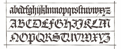
The Textura example at left was hand lettered by Hermann Zapf and printed in his book "Feder und Stichel" (Pen and Graver), which displayed his versions of major historical styles. Scripsit also shows examples of Zapf's "Blackletter" typefaces, such as Gilgengart and Hallmark Textura.
The Spring 1999 issue, "Collaborative Discoveries," explores the creative interaction that occurs when two or more calligraphers work together on a project. Editor Joan Machinchick discusses the book of poetry she produced with Lynne Carnes and Suzanne Heany and an ongoing calendar project she does with five other calligraphers. Marta Legeckis and Jane Coates each shared her perspective on a piece they created together called "Conversations."
In the Winter 1999 issue of Scripsit, calligrapher Michael Clark asked several of America's top lettering artists
to address a specific tool or alphabet. "The how's and why's of an individual piece of lettering provide insight into not only the work itself
but the artist's process," Clark explains.
Among the topics covered are: John Stevens on the brush; Julian Waters on Italic; Ward Dunham on the chisel-edged pen; Peter Horridge on
combining illustration and calligraphy; and Michael Clark himself on the ruling pen.
|
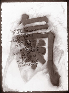 A recent Scripsit (Vol. 23, No. 1) explores Eastern ideas that can be beneficial to practicing calligraphers in the West. Being "in the flow" is a place we all want to be. Yoga, meditation and Ki work can help us to be in that place. By being still and listening to those voices that are usually drowned out, by aligning our bodies and our spirits, by working with breath and energy, we can access our inner core, freeing us to express our authentic selves.
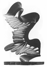
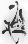 In assembling the issue, Clark sought to dispel the notion of abstract as intentionally obscure. "It is much more demanding to use a single stroke, a letter, a word or a series of words to create a visual that defies being read, but gives meaning and purpose to the paper upon which it rests," he explained.
