|
by Julian Waters
The term calligraphy comes from two Greek words roughly meaning artistic beauty and writing or drawing. However, calligraphy does not necessarily have to be beautiful in order to be of quality. A better test is whether it is expressively appropriate and whether it communicates well. Today, in addition to being a kind of communication, calligraphy is a serious art form. Through the style and composition of written forms the calligrapher attempts to visually interpret the spirit of texts, headlines, logos, painterly and abstract works.
Modern western calligraphy is rooted in the development of written symbols and letterforms over thousands of years, from the earliest scratchings in dirt, cave painting and pictograms to the great classical inscriptions, and Mediaeval, Renaissance and Baroque manuscripts. The development of letterforms continued through the use of engraving and other technologies, and in the forms of typefaces used in printing, from the mid-fifteenth century up to the present. At the end of the nineteenth century broad-edged pen techniques were rediscovered by pioneers including Edward Johnston in England and Rudolf Koch in Germany. Much is owed to them and to their students and followers who helped spread renewed interest in the art.
Today, the best calligraphers start with many years of historical study and technical practice, learning from high points of scribal history. They seek out individual experts as mentors and try to keep up with developments in the field, as in any profession. It is important to study fine arts, graphic design, music and many other subjects. Through much hard work, skill and taste should increase and a personal style may develop. As in all arts, we respect the past and learn from it, but we must also create things which have some relevance in today's world.
CALLIGRAPHY: Calligraphy is a form of artistic writing wherein letters may be made in few or many direct strokes. It can at times be legible and at other times completely indecipherable. The most elegant and consistently harmonious calligraphy can be a self- conscious and highly disciplined act and is the result of much pre-planning and trial and error. Spirited non-legible work is not always an outgrowth of preconceived notions of how letters of the alphabet should appear. It is a kind of gestural drawing or painting which captures the impulses and emotions of a moment in time. Spontaneous work often happens instantly on the paper in very quick gestures, after many years of practice and many minutes of contemplation or mental pre-planning. Chinese master calligraphers often use this method of approaching their work. Sometimes it is a matter of making variations of the same design many times until a favorite materializes.
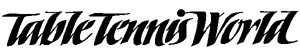
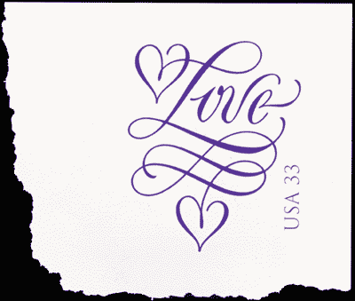
LETTERING: Strictly speaking, if the word calligraphy refers to direct writing, the term lettering usually refers to drawn, built-up or retouched forms. Logos, headlines and most works for reproduction fit this category. After many rough sketches are made, a magazine headline or logo may be freely executed in pure calligraphic strokes. Then it usually needs to be carefully modified so that all of the elements balance and everything will reproduce well. Built-up forms can be understood as a kind of additive sculpture, where a form thickens up over an armature until the designer's conception is achieved. Retouching with white paint is like subtractive sculpture, as in wood or stone carving. By adding white, outer layers are chipped and peeled away to reveal an underlying ideal form. The term lettering may also be used to cover every kind of letter-making, including calligraphy, drawn lettering, monumental lettercarving, typeface design, and so on.
TYPEFACE DESIGN: Gutenberg's blackletter types and the early Venetian roman typefaces were based on the broad-edged pen calligraphy of their day. Metal type took the place of calligraphy and the printed book spread knowledge to the masses. Traditionally, typeface design was practiced by a few specialists working for large type foundries. It was a very long process starting with original drawings, many proofing stages, the excruciatingly detailed and demanding art of punch cutting and on to the finished cast metal type. Now, through the use of the personal computer, many more people are designing alphabets in much less time. However, the best, lasting designs are still produced by experts: creative designers and experienced professionals who put as much thought into the space inside and between letters as the linear shapes and contours of letters themselves. As in Gutenberg's time, some modern types start as pen writing and hand drawing, and are reborn as typefaces, or "fonts" which can be seen in magazines, packaging, signage and websites.
While the computer is widely used in letterform design, it is simply another tool, like the pencil, pen and brush, in the hands of the designer. Whether made with ink on Japanese paper, or by manipulating Bezier outline curves on a Macintosh computer, letterforms are still conceived by humans, using the mind, the heart and the hand. As Paul Standard said, "Geometry can produce legible letters, but art alone makes them beautiful. Art begins where geometry ends, and imparts to letters a character transcending mere measurement."
No portion of this article may be reproduced without the author's consent. Julian Waters Hand Lettering and Design, 301-253-3422. waterslettering@erols.com
|
 The Chinese calligrapher Wang Hsi-chih said, "Writing needs meaning, whereas calligraphy expresses itself above all through forms and gestures. It elevates the soul and illuminates the feelings." In this respect calligraphy is very close to painting and they have the same beginning. Prehistoric mark-making used powerfully evocative, primitive written forms.